Ant消息响应组件
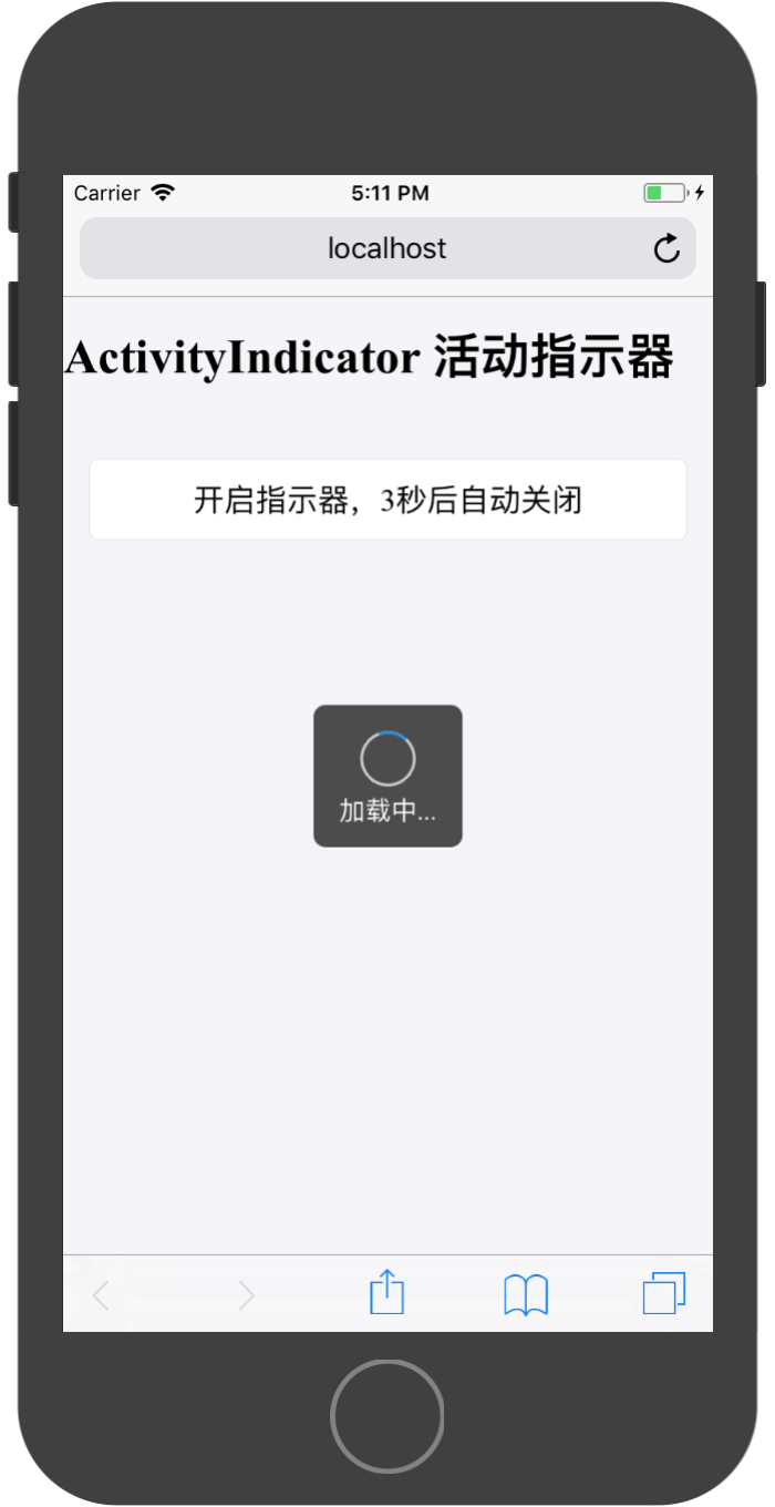
ActivityIndicator 活动指示器
活动指示器。 表明某个任务正在进行中。
默认规则:
- 不要让活动指示器静止,用户会以为该任务停滞了。
- 在某些特定场景下,提供有意义的文案,帮助用户明白哪个任务正在进行中,eg:正在上传照片。
- 如果能知道用户的等待时间,可以使用组件 Progress 来替代。
组件API:
| 属性 | 说明 | 类型 | 默认值 |
|---|---|---|---|
| animating | 显隐状态 | boolean | true |
| size | spinner大小,可选small/large | string | small |
| toast | loading样式类型 | boolean | false |
| ext | loading文本 | string | - |
使用参考:
<ActivityIndicator />
<ActivityIndicator color="white" />
<ActivityIndicator size="large" />
<ActivityIndicator text="正在加载" />
<ActivityIndicator toast />
<ActivityIndicator toast text="正在加载" />
实现代码:
import React, { Component } from 'react';

import {ActivityIndicator,Toast, Icon,WhiteSpace,Button,List,Carousel,Card,WingBlank,Grid,NoticeBar,Tag} from 'antd-mobile';


export default class App extends Component {

  constructor(props) {
    super(props)

    this.state = {
      animating:false,
    }
  }


  render() {

    return (
        <div>
          <ActivityIndicator
            animating={this.state.animating}
            size={'large'}
            toast={true}
            text={'加载中...'}
          />
          <h1>{'ActivityIndicator 活动指示器'}</h1>
          <WhiteSpace size="lg" />
          <WingBlank>
            <WhiteSpace />
            <Button
              onClick={()=>{
                this.setState({
                  animating:true
                });
                setTimeout(()=>{
                  this.setState({
                  animating:false
                });
                },3000)
              }}
            >
              开启指示器,3秒后自动关闭
            </Button>
          </WingBlank>
        </div>
    );
  }
}
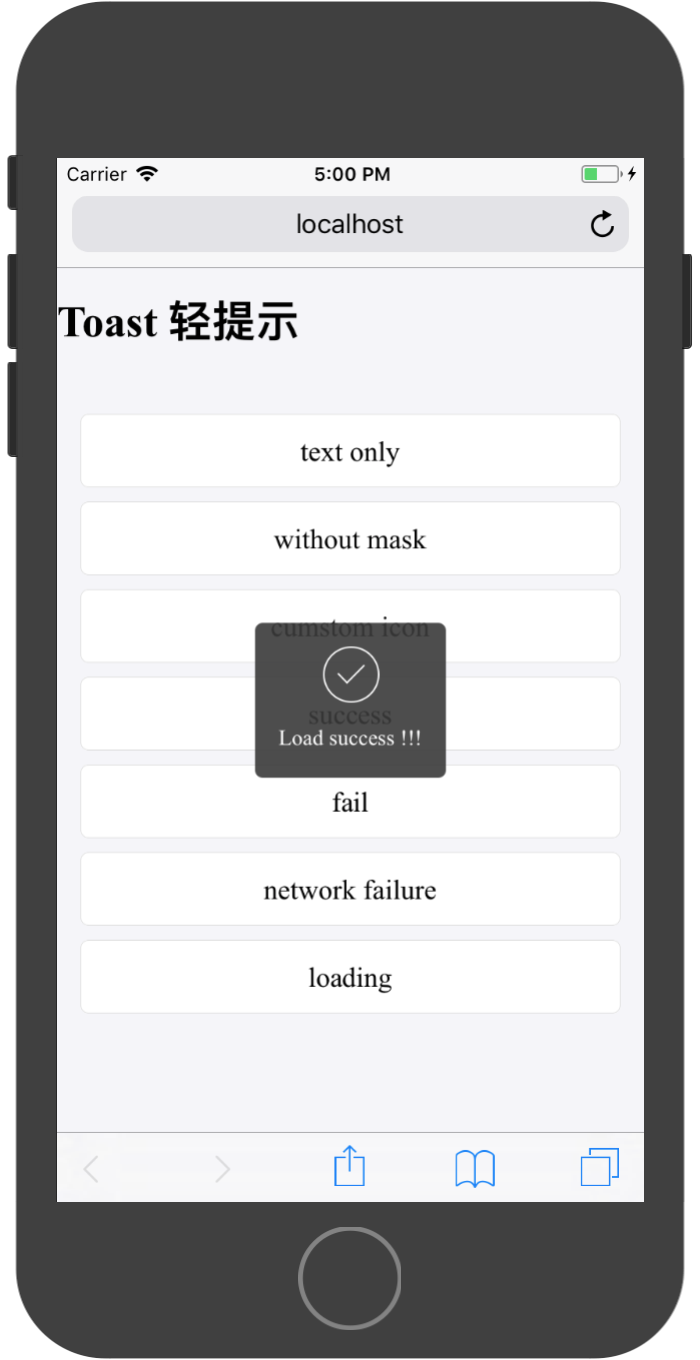
Toast 轻提示
一种轻量级反馈/提示,可以用来显示不会打断用户操作的内容,适合用于页面转场、数据交互的等场景中。
默认规则:
- 一次只显示一个 toast。
- 有 Icon 的 Toast,字数为 4-6 个;没有 Icon 的 Toast,字数不宜超过 14 个。
该组件提供了五个静态方法,用于展示Toast提示框:
Toast.success(content, duration, onClose, mask)Toast.fail(content, duration, onClose, mask)Toast.info(content, duration, onClose, mask)Toast.loading(content, duration, onClose, mask)Toast.offline(content, duration, onClose, mask)
参数说明:
| 属性 | 说明 | 类型 | 默认值 |
|---|---|---|---|
| content | 提示内容 | React.Element or String | 无 |
| duration | 自动关闭的延时,单位秒 | number | 3 |
| onClose | 关闭后回调 | Function | 无 |
| mask | 是否显示透明蒙层,防止触摸穿透 | Boolean | true |
注:
duration = 0时,onClose无效,toast不会消失;隐藏toast需要手动调用hide()
组件提供了全局配置和全局销毁方法:
Toast.hide()
参考代码实现:
import React, { Component } from 'react';

import {Toast, Icon,WhiteSpace,Button,List,Carousel,Card,WingBlank,Grid,NoticeBar,Tag} from 'antd-mobile';

function showToast() {
  Toast.info('This is a toast tips !!!', 1);
}

function showToastNoMask() {
  Toast.info('Toast without mask !!!', 2, null, false);
}

function successToast() {
  Toast.success('Load success !!!', 10);
}

function failToast() {
  Toast.fail('Load failed !!!', 1);
}

function offline() {
  Toast.offline('Network connection failed !!!', 1);
}

function loadingToast() {
  Toast.loading('Loading...', 1, () => {
    console.log('Load complete !!!');
  });
}

const customIcon = () => (
  <svg xmlns="http://www.w3.org/2000/svg" viewBox="0 0 64 64" className="am-icon am-icon-md">
    <path fillRule="evenodd" d="M59.177 29.5s-1.25 0-1.25 2.5c0 14.47-11.786 26.244-26.253 26.244C17.206 58.244 5.417 46.47 5.417 32c0-13.837 11.414-25.29 25.005-26.26v6.252c0 .622-.318 1.635.198 1.985a1.88 1.88 0 0 0 1.75.19l21.37-8.545c.837-.334 1.687-1.133 1.687-2.384C55.425 1.99 53.944 2 53.044 2h-21.37C15.134 2 1.667 15.46 1.667 32c0 16.543 13.467 30 30.007 30 16.538 0 29.918-13.458 29.993-30 .01-2.5-1.24-2.5-1.24-2.5h-1.25" />
  </svg>
);

export default class App extends Component {

  componentDidMount() {
    Toast.loading('Loading...', 30, () => {
      console.log('Load complete !!!');
    });

    setTimeout(() => {
      Toast.hide();
    }, 3000);
  }

  render() {

    return (
        <div>
          <h1>{'Toast 轻提示'}</h1>
          <WhiteSpace size="lg" />
          <WingBlank>
            <WhiteSpace />
            <Button onClick={showToast}>text only</Button>
            <WhiteSpace />
            <Button onClick={showToastNoMask}>without mask</Button>
            <WhiteSpace />
            <Button onClick={() => Toast.info(customIcon(), 1)}>
              cumstom icon
            </Button>
            <WhiteSpace />
            <Button onClick={successToast}>success</Button>
            <WhiteSpace />
            <Button onClick={failToast}>fail</Button>
            <WhiteSpace />
            <Button onClick={offline}>network failure</Button>
            <WhiteSpace />
            <Button onClick={loadingToast}>loading</Button>
            <WhiteSpace />
          </WingBlank>
        </div>
    );
  }
}
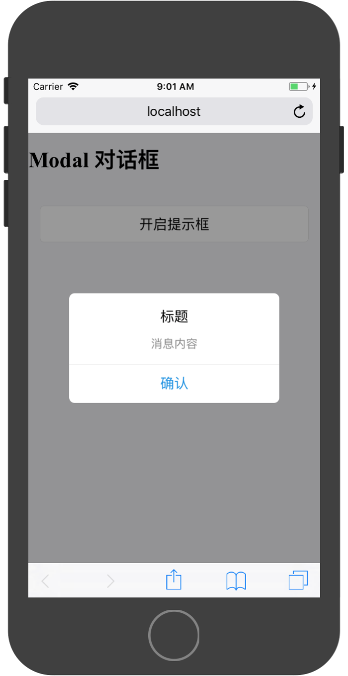
Modal 对话框
用作显示系统的重要信息,并请求用户进行操作反馈,eg:删除某个重要内容时,弹出 Modal 进行二次确认。
- 尽可能少用。Modal 会打断用户操作,只用在重要的时候。
- 标题应该简明,不能超过 1 行;描述内容应该简明、完整,一般不多于 2 行。
- 操作按钮最多到 3 个(竖排),一般为 1-2 个(横排);3 个以上建议使用组件 ActionSheet 来完成。
- 一般将用户最可能点击的按钮,放在右侧。另外,取消按钮应当始终放在左侧。
Modal对话框提供了三种默认样式:
Modal.alert,模态信息提示框Modal.prompt,带输入内容的信息提示框Modal.operation,操作选择提示框
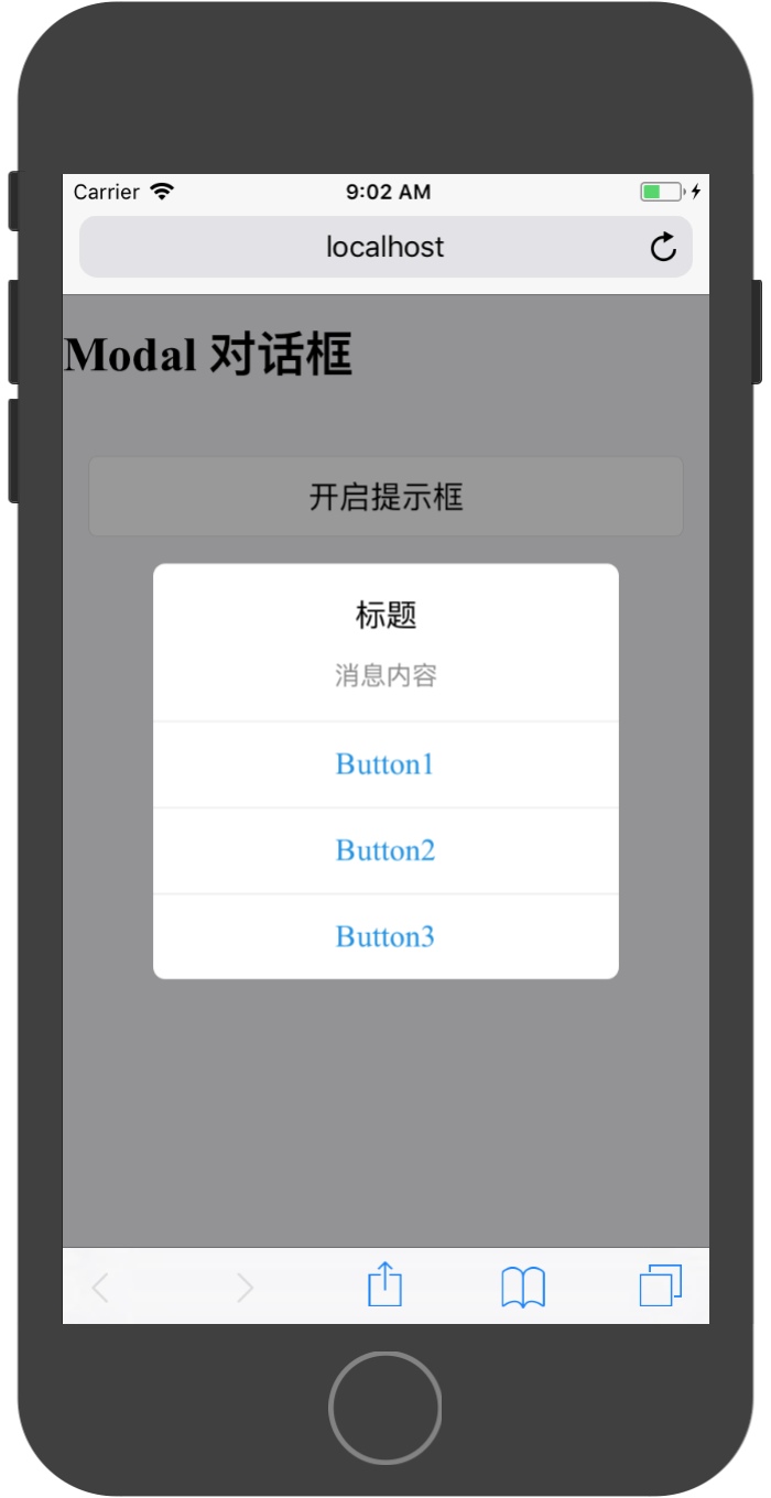
使用Modal.alert展现如下:
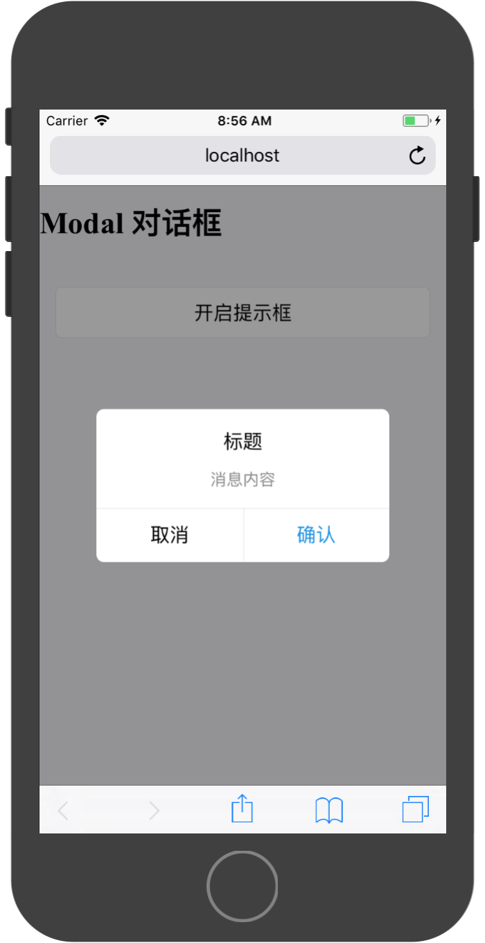
通过配置其API,可以调整标题、内容和按钮的响应事件
| 属性 | 说明 | 类型 | 默认值 | |
|---|---|---|---|---|
| title | 标题 | String 或 React.Element | 无 | |
| message | 提示信息 | String 或 React.Element | 无 | |
| actions | 按钮组, | {text, onPress, style} | Array | 无 |
使用参考代码:
import React, { Component } from 'react';

import {Modal,Toast, Icon,WhiteSpace,Button,List,Carousel,Card,WingBlank,Grid,NoticeBar,Tag} from 'antd-mobile';


export default class App extends Component {

  render() {

    return (
        <div>
          <h1>{'Modal 对话框'}</h1>
          <WhiteSpace size="lg" />
          <WingBlank>
            <WhiteSpace />
            <Button
              onClick={()=>{
                Modal.alert(
                  '标题',
                  '消息内容',
                  [
                    {
                      text:'取消',
                      onPress:()=>{
                        console.log('点击取消按钮');
                        Toast.info('点击取消按钮');
                      }
                    },
                    {
                      text:'确认',
                      onPress:()=>{
                        console.log('点击确认按钮')
                        Toast.info('点击确认按钮');
                      }
                    },
                  ]
                )
              }}
            >
              开启提示框
            </Button>
          </WingBlank>
        </div>
    );
  }
}
提示框支持1到n个按钮展示,通过配置actions属性即可实现:
使用Modal.prompt基本展示效果如下:
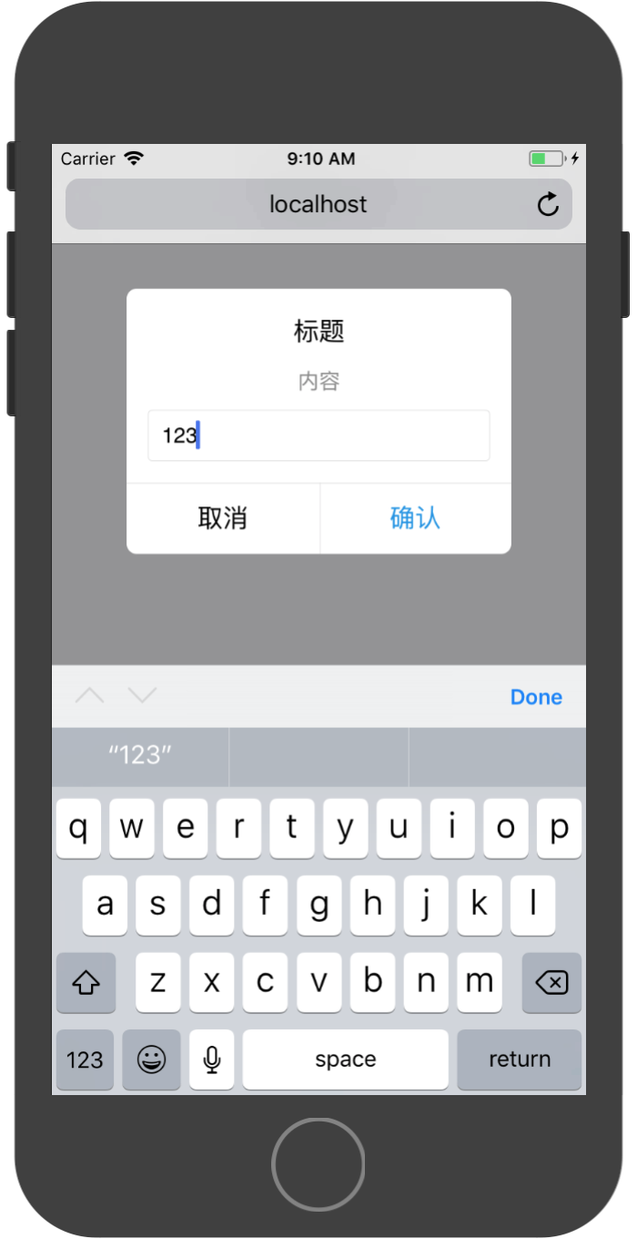
API列表为:
| 属性 | 说明 | 类型 | 默认值 | |
|---|---|---|---|---|
| title | 标题 | String 或 React.Element | 无 | |
| message | 提示信息 | String 或 React.Element | 无 | |
| actions | 按钮组, | {text, onPress, style} | Array | 无 |
| type | prompt 的样式 | String (default, secure-text, login-password) | default |
在配置按钮回调的onPress函数时,该函数会携带一个参数,该参数存储用户的输入内容。如在login-password模式下,函数携带两个参数,第一个参数为用户名,第二个参数为密码。
上图的实现代码为:
import React, { Component } from 'react';

import {Modal,Toast, Icon,WhiteSpace,Button,List,Carousel,Card,WingBlank,Grid,NoticeBar,Tag} from 'antd-mobile';


export default class App extends Component {

  render() {

    return (
        <div>
          <h1>{'Modal 对话框'}</h1>
          <WhiteSpace size="lg" />
          <WingBlank>
            <WhiteSpace />
            <Button
              onClick={()=>{
                Modal.prompt(
                  '标题',
                  '内容',
                  [
                    {
                      text:'取消',
                    },
                    {
                      text:'确认',
                      onPress:(value)=>{
                        Toast.info(`输入内容为:${value}`);
                      }
                    }
                  ]
                )
              }}
            >
              开启提示框
            </Button>
          </WingBlank>
        </div>
    );
  }
}
Modal.operation为操作选择提示框,没有标题和内容,只有要执行的操作。
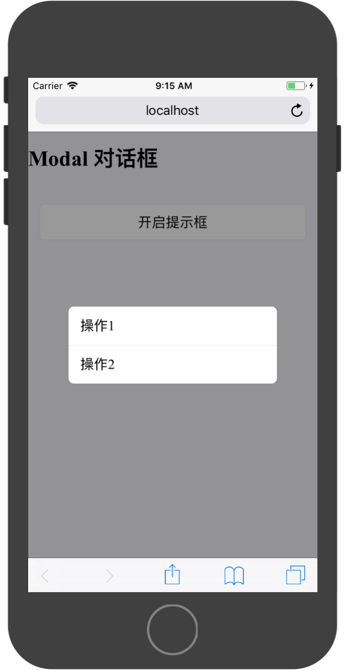
其API只有一个属性:
| 属性 | 说明 | 类型 | 默认值 | |
|---|---|---|---|---|
| actions | 按钮组, | {text, onPress, style} | Array | 无 |
实现代码:
import React, { Component } from 'react';

import {Modal,Toast, Icon,WhiteSpace,Button,List,Carousel,Card,WingBlank,Grid,NoticeBar,Tag} from 'antd-mobile';


export default class App extends Component {

  render() {

    return (
        <div>
          <h1>{'Modal 对话框'}</h1>
          <WhiteSpace size="lg" />
          <WingBlank>
            <WhiteSpace />
            <Button
              onClick={()=>{
                Modal.operation(
                  [
                    {
                      text:'操作1',
                      onPress:()=>{
                        Toast.info('选择操作1')
                      }
                    },
                    {
                      text:'操作2',
                      onPress:()=>{
                        Toast.info('选择操作2')
                      }
                    }
                  ]
                )
              }}
            >
              开启提示框
            </Button>
          </WingBlank>
        </div>
    );
  }
}
ActionSheet 动作面板
从底部弹出的模态框,提供和当前场景相关的 2 个以上的操作动作,也支持提供标题和描述。内置固定的展示样式、不支持特别灵活的修改。
默认规则
- 提供清晰的退出按钮。
- 可高亮破坏性操作,e.g. 将『删除』处理成红色文本。
- 不要放置过多内容,避免面板纵向滚动。
动作面板提供两种静态API接口:
操作选择列表展示:static showActionSheetWithOptions(options: Object, callback: Function)
options (array of strings)- 按钮标题列表 (required)cancelButtonIndex (int)- 按钮列表中取消按钮的索引位置destructiveButtonIndex (int)- 按钮列表中破坏性按钮(一般为删除)的索引位置title (string)- 顶部标题message (string/React.element)- 顶部标题下的简要消息maskClosable (bool)- 点击蒙层是否允许关闭,默认允许
回调函数中携带一个参数,储存被点击的按钮索引值。
展示实例:

实现代码:
import React, { Component } from 'react';

import {ActionSheet,Modal,Toast, Icon,WhiteSpace,Button,List,Carousel,Card,WingBlank,Grid,NoticeBar,Tag} from 'antd-mobile';


export default class App extends Component {

  render() {

    return (
        <div>
          <h1>{'ActionSheet 动作面板'}</h1>
          <WhiteSpace size="lg" />
          <WingBlank>
            <WhiteSpace />
            <Button
              onClick={()=>{
                ActionSheet.showActionSheetWithOptions(
                  {
                    title:'选择图片',
                    options:[
                      '图片库',
                      '相机',
                      '取消'
                    ],
                    cancelButtonIndex:2,
                  },
                  (buttonIndex)=>{
                    Toast.info(`点击按钮索引值为:${buttonIndex}`);
                  }
                )
              }}
            >
              开启动作面板
            </Button>
          </WingBlank>
        </div>
    );
  }
}
分享选择展示:static showShareActionSheetWithOptions(options: Object, callback: Function)
options (array of {icon: ReactNode, title: string})- 分享按钮列表 (required)cancelButtonText (string)- 取消按钮文案,默认为取消title (string)- 顶部标题message (string/React.element)- 顶部标题下的简要消息
options可以是二维数组,能显示多行按钮,例如[[{icon,title},...],...]表示两行两列。当为二维数组时callback有两个参数,第一个为列序列、第二个为行序列。

实现代码:
import React, { Component } from 'react';

import {ActionSheet,Modal,Toast, Icon,WhiteSpace,Button,List,Carousel,Card,WingBlank,Grid,NoticeBar,Tag} from 'antd-mobile';


export default class App extends Component {

  render() {

    return (
        <div>
          <h1>{'ActionSheet 动作面板'}</h1>
          <WhiteSpace size="lg" />
          <WingBlank>
            <WhiteSpace />
            <Button
              onClick={()=>{
                ActionSheet.showShareActionSheetWithOptions(
                  {
                    title:'分享',
                    options:[
                      {
                        title: '发送给朋友',
                        icon: (
                          <img
                            src={`https://gw.alipayobjects.com/zos/rmsportal/OpHiXAcYzmPQHcdlLFrc.png`}
                            alt={'发送给朋友'}
                            style={{ width: 36 }}
                          />
                        ),
                      },
                      {
                        title: '新浪微博',
                        icon: (
                          <img
                            src={`https://gw.alipayobjects.com/zos/rmsportal/wvEzCMiDZjthhAOcwTOu.png`}
                            alt={'新浪微博'}
                            style={{ width: 36 }}
                          />
                        ),
                      },
                      {
                        title: '生活圈',
                        icon: (
                          <img
                            src={`https://gw.alipayobjects.com/zos/rmsportal/cTTayShKtEIdQVEMuiWt.png`}
                            alt={'生活圈'}
                            style={{ width: 36 }}
                          />
                        ),
                      },
                      {
                        title: '微信好友',
                        icon: (
                          <img
                            src={`https://gw.alipayobjects.com/zos/rmsportal/umnHwvEgSyQtXlZjNJTt.png`}
                            alt={'微信好友'}
                            style={{ width: 36 }}
                          />
                        ),
                      },
                      {
                        title: 'QQ',
                        icon: (
                          <img
                            src={`https://gw.alipayobjects.com/zos/rmsportal/SxpunpETIwdxNjcJamwB.png`}
                            alt={'QQ'}
                            style={{ width: 36 }}
                          />
                        ),
                      },
                    ],
                  },
                  (buttonIndex)=>{
                    Toast.info(`点击按钮索引值为:${buttonIndex}`);
                  }
                )
              }}
            >
              开启动作面板
            </Button>
          </WingBlank>
        </div>
    );
  }
}