Ant列表组件
在WebApp中,大部分的数据通过列表进行展示,并且可以上下滑动,例如联系人列表、朋友圈等。
List 列表
List为一个容器,可以装载多种组件进行上下滑动显示。其默认装载组件为List.Item组件。
此列表只能展示有限多数据,如数据无限多,应采用
ListView
默认规则:
- 一般由主要信息、主要操作、次要信息、次要操作组成。
- 主要信息和主要操作放在列表的左边,次要信息和次要操作放在列表的右边。
ListAPI只有两个属性:
| 属性 | 说明 | 类型 | 默认值 |
|---|---|---|---|
| renderHeader | list heder | (): string | 无 |
| renderFooter | list footer | (): string | 无 |
通过这两属性可以配置列表的头部和尾部的内容。
列表中的内容通过其装载的Item类组件提供,常用的Item类组件有:
- List.Item
- InputItem
- Radio.RadioItem
- Checkbox.CheckboxItem
List.Item
List.Item为List组件自带的内容显示组件,其提供了丰富的可配置API,可以展示多种信息:
| 属性 | 说明 | 类型 | 默认值 |
|---|---|---|---|
| thumb | 缩略图(当为 string 类型时作为 img src) | String/React.Element | 无 |
| extra | 右边内容 | String/React.Element | 无 |
| arrow | 箭头方向(右,上,下), 可选horizontal,up,down,empty,如果是empty则存在对应的dom,但是不显示 | String | 无 |
| align | 子元素垂直对齐,可选top,middle,bottom | String | middle |
| onClick | 点击事件的回调函数 | (): void | 无 |
| multipleLine | 多行 | Boolean | false |
| wrap | 是否换行,默认情况下,文字超长会被隐藏 | Boolean | false |
| activeStyle | 自定义active的样式 | Object | 无 |
| platform | 设定组件的平台特有样式, 可选值为 android, ios, 默认为 cross, 即组件会自动检测设备 UA 应用不同平台的样式 | String | 'cross' |
基础用法:
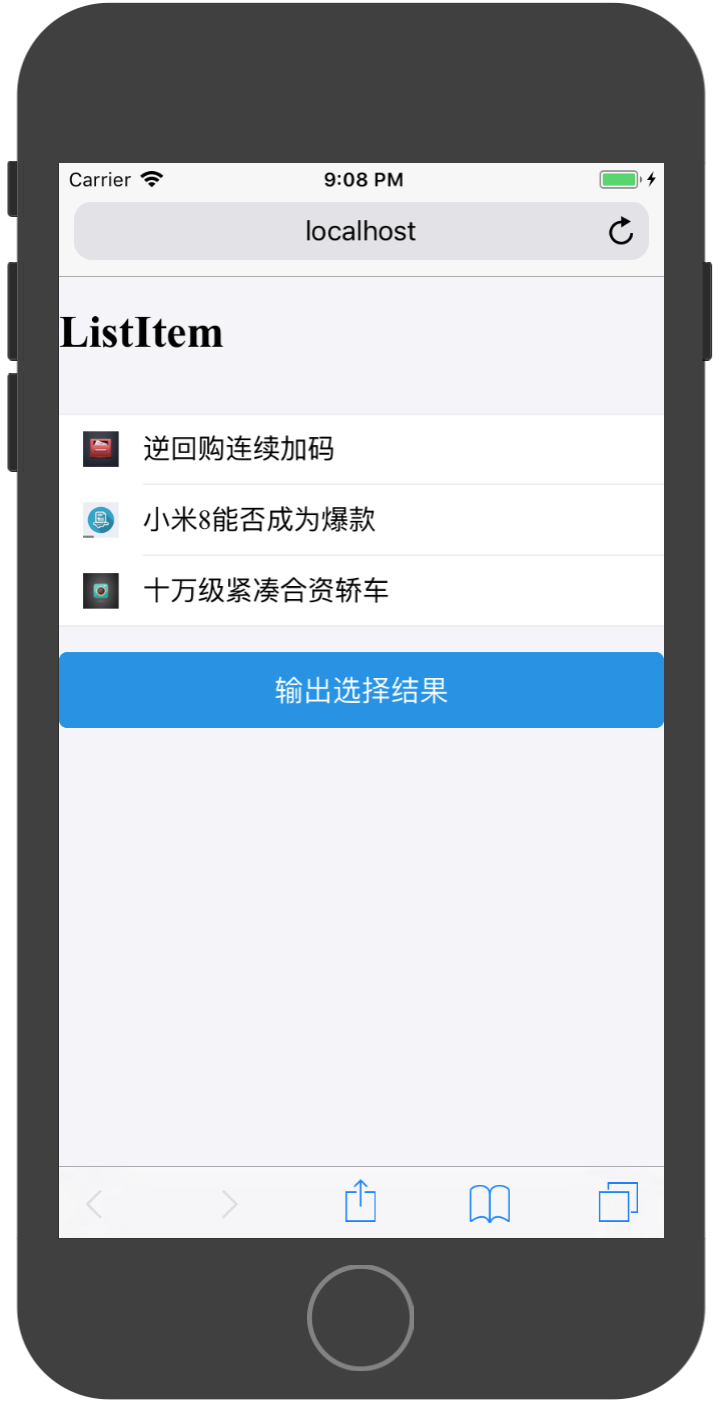
实现代码为:
import React, { Component } from 'react';

import { Button,List} from 'antd-mobile';


//所需展示数据

const messages = [
  {
    id:10001,
    title:'逆回购连续加码',
    image:'http://suo.im/5bvA3t'
  },
  {
    id:10002,
    title:'小米8能否成为爆款',
    image:'http://suo.im/4AAWQa'
  },
  {
    id:10003,
    title:'十万级紧凑合资轿车',
    image:'http://suo.im/5qy03v'
  }
]

export default class App extends Component {


  render() {

    const listItems = [];
    for(let i=0;i<messages.length;i++){
      const message = messages[i];
      const listItem = (
        <List.Item
          key={message.id}
          thumb={message.image}
        >
          {message.title}
        </List.Item>
      )
      listItems.push(listItem);
    }

    return (
        <div>
          <h1>{'ListItem'}</h1>
          <br/>
          <List>
            {listItems}
          </List>
          <br/>
          <Button
            type={'primary'}
            onClick={()=>{
              //模拟登陆
              console.log(this.state.date)
            }}
          >输出选择结果</Button>
        </div>
    );
  }
}
通过List.Item.Brief可以为Item添加子标题:
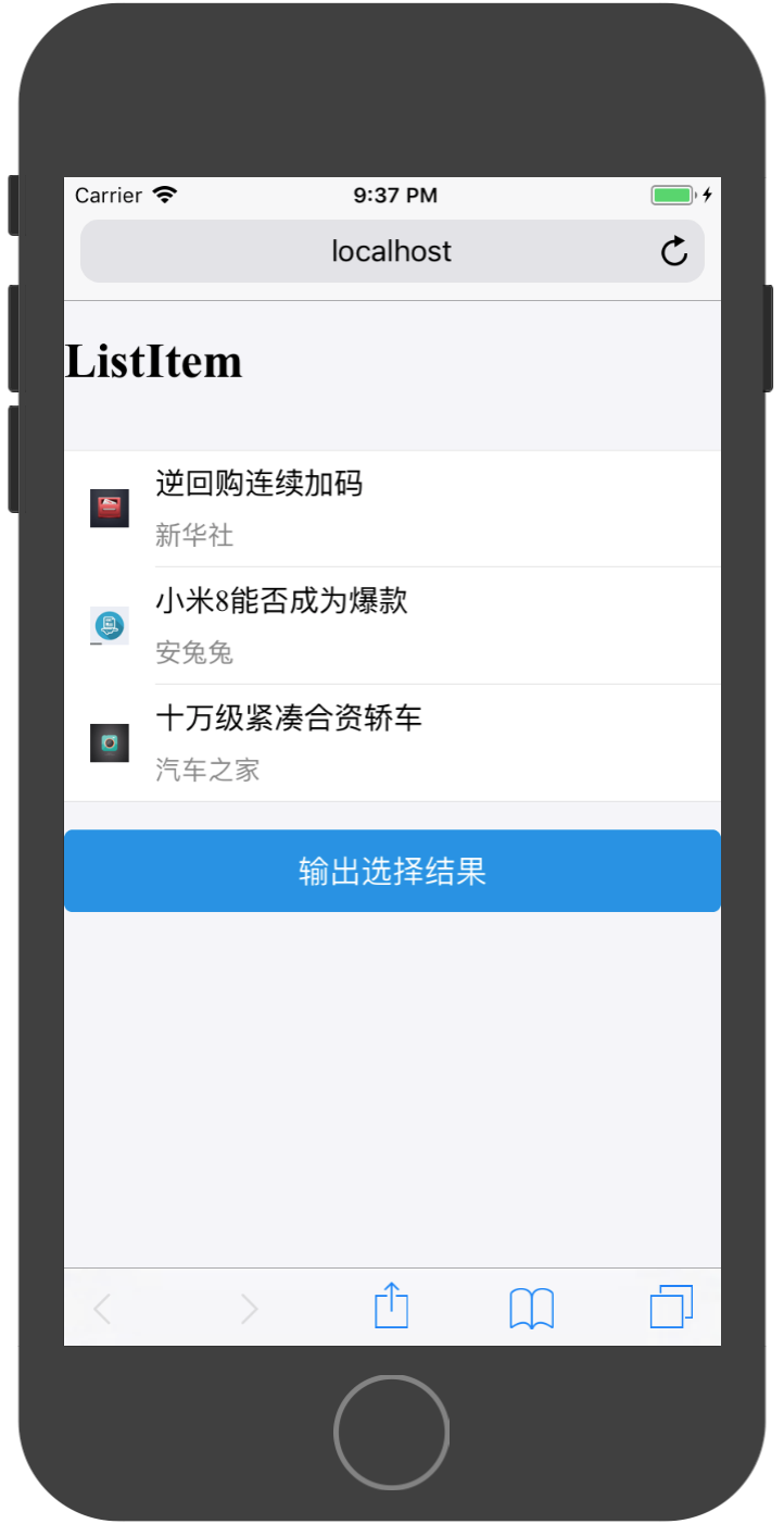
import React, { Component } from 'react';

import { Button,List} from 'antd-mobile';


//所需展示数据

const messages = [
  {
    id:10001,
    title:'逆回购连续加码',
    content:'新华社',
    image:'http://suo.im/5bvA3t',
    like:10,
  },
  {
    id:10002,
    title:'小米8能否成为爆款',
    content:'安兔兔',
    image:'http://suo.im/4AAWQa',
    like:11,
  },
  {
    id:10003,
    title:'十万级紧凑合资轿车',
    content:'汽车之家',
    image:'http://suo.im/5qy03v',
    like:12,
  }
]

export default class App extends Component {


  render() {

    const listItems = [];
    for(let i=0;i<messages.length;i++){
      const message = messages[i];
      const listItem = (
        <List.Item
          key={message.id}
          thumb={message.image}
        >
          {message.title}
          <List.Item.Brief>
            {message.content}
          </List.Item.Brief>
        </List.Item>
      )
      listItems.push(listItem);
    }

    return (
        <div>
          <h1>{'ListItem'}</h1>
          <br/>
          <List>
            {listItems}
          </List>
          <br/>
          <Button
            type={'primary'}
            onClick={()=>{
              //模拟登陆
              console.log(this.state.date)
            }}
          >输出选择结果</Button>
        </div>
    );
  }
}
通过配置arrow属性可以在Item最右边添加一个箭头:

实现部分代码为:
<List.Item
    key={message.id}
    thumb={message.image}
    arrow={'horizontal'}
>
    {message.title}
    <List.Item.Brief>
    {message.content}
    </List.Item.Brief>
</List.Item>
通过配置onClick属性,可以响应该Item的点击事件:
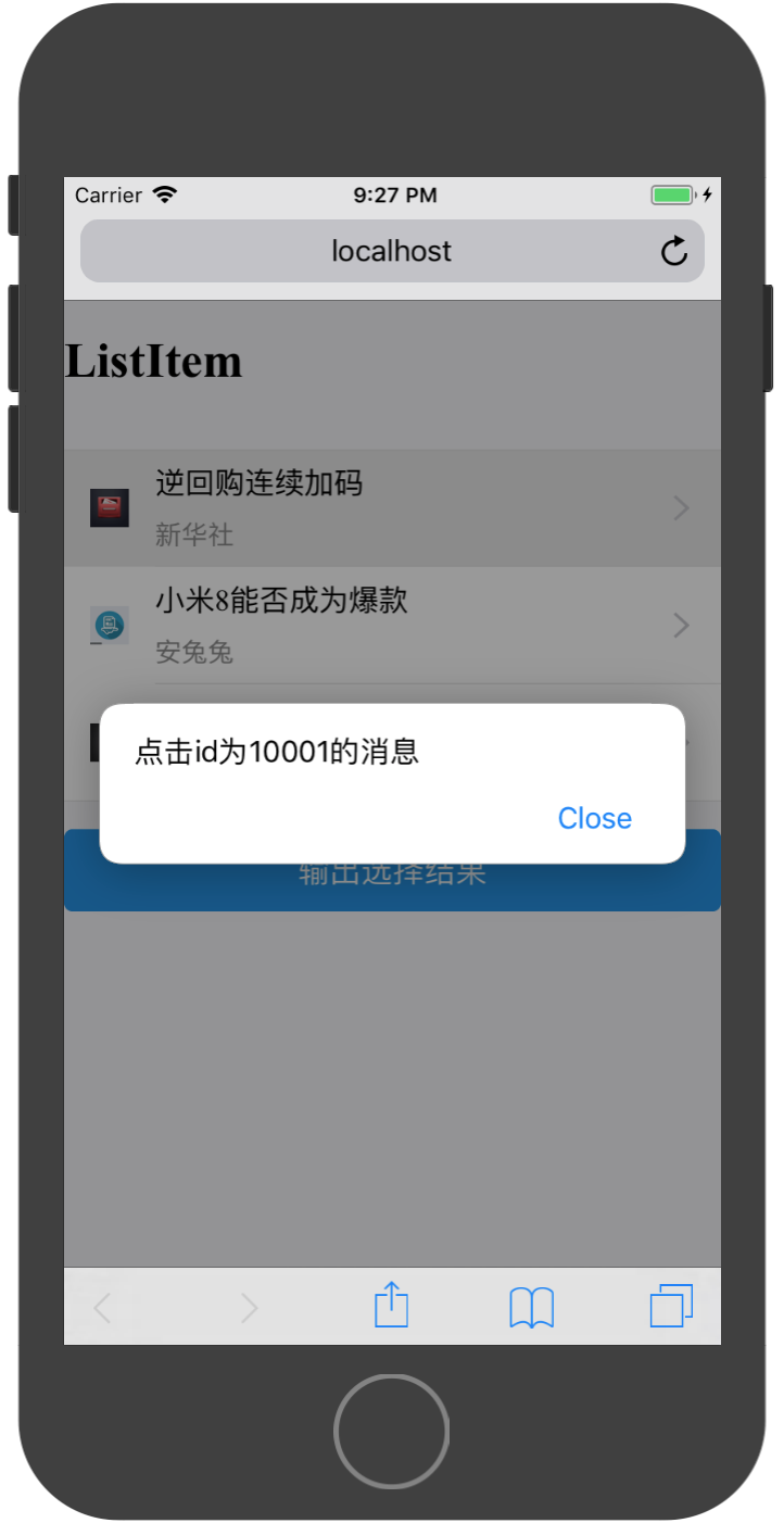
部分实现代码为:
<List.Item
    key={message.id}
    thumb={message.image}
    arrow={'horizontal'}
    onClick={()=>{
    alert(`点击id为${message.id}的消息`);
    }}
>
    {message.title}
    <List.Item.Brief>
    {message.content}
    </List.Item.Brief>
</List.Item>
通过配置extra属性,可以在Item右边添加文字说明:
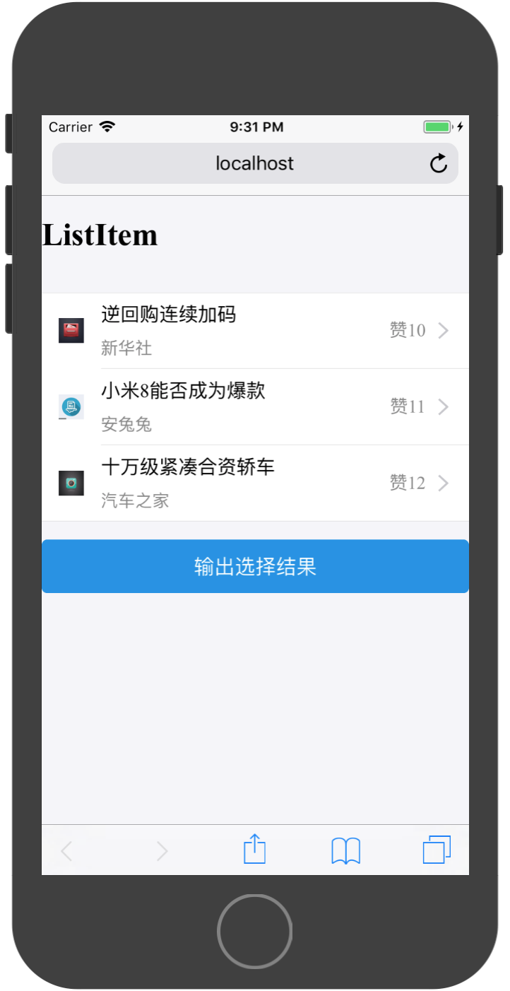
实现代码为:
import React, { Component } from 'react';

import { Button,List} from 'antd-mobile';


//所需展示数据

const messages = [
  {
    id:10001,
    title:'逆回购连续加码',
    content:'新华社',
    image:'http://suo.im/5bvA3t',
    like:10,
  },
  {
    id:10002,
    title:'小米8能否成为爆款',
    content:'安兔兔',
    image:'http://suo.im/4AAWQa',
    like:11,
  },
  {
    id:10003,
    title:'十万级紧凑合资轿车',
    content:'汽车之家',
    image:'http://suo.im/5qy03v',
    like:12,
  }
]

export default class App extends Component {


  render() {

    const listItems = [];
    for(let i=0;i<messages.length;i++){
      const message = messages[i];
      const listItem = (
        <List.Item
          key={message.id}
          thumb={message.image}
          arrow={'horizontal'}
          onClick={()=>{
            alert(`点击id为${message.id}的消息`);
          }}
          extra={`赞${message.like}`}
        >
          {message.title}
          <List.Item.Brief>
            {message.content}
          </List.Item.Brief>
        </List.Item>
      )
      listItems.push(listItem);
    }


    return (
        <div>
          <h1>{'ListItem'}</h1>
          <br/>
          <List>
            {listItems}
          </List>
          <br/>
          <Button
            type={'primary'}
            onClick={()=>{
              //模拟登陆
              console.log(this.state.date)
            }}
          >输出选择结果</Button>
        </div>
    );
  }
}
Radio 单选框
WebApp中的单选框和传统Web中的样式不一样,因WebApp中主要使用手指进行触控操作,而传统Web中是使用鼠标进行操作。所以传统Web中的小圆点不在适用于WebApp。
一个简单的多选页面如下:
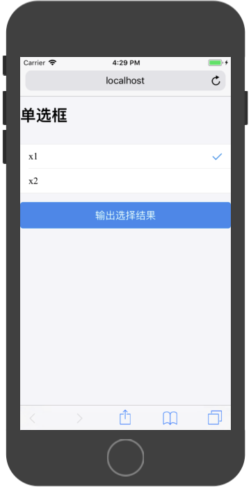
AntDesign框架采用 RadioItem组件实现单选操作,其组件API如下:
| 属性 | 说明 | 类型 | 默认值 | |
|---|---|---|---|---|
| name | name | String | 无 | |
| checked | 指定当前是否选中 | Boolean | 无 | |
| onChange | change | 事件触发的回调函数 | (e: Object): void | 无 |
import React, { Component } from 'react';

import { Button,Radio,List} from 'antd-mobile';

const RadioItem = Radio.RadioItem;

export default class App extends Component {

  constructor(props) {
    super(props)

    this.state = {
      checked:0
    }
  }


  render() {
    return (
        <div>
          <h1>单选框</h1>
          <br/>
          <List>
            <RadioItem
              key={0}
              checked={0===this.state.checked}
              onChange={()=>{this.setState({checked:0})}}
            >x1</RadioItem>
            <RadioItem
              key={1}
              checked={1===this.state.checked}
              onChange={()=>{this.setState({checked:1})}}
            >x2</RadioItem>
          </List>
          <br/>
          <Button
            type={'primary'}
            onClick={()=>{
              //模拟登陆
              console.log(this.state.checked)
            }}
          >输出选择结果</Button>
        </div>
    );
  }
}
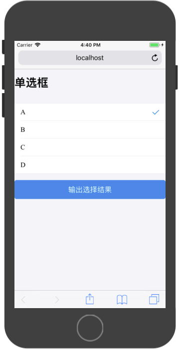
对于动态单选框,可以参考如下代码进行实现:
import React, { Component } from 'react';

import { Button,Radio,List} from 'antd-mobile';

const RadioItem = Radio.RadioItem;

//单选选项数据
const radioDatas = [
  {
    id:0,
    title:'A'
  },
  {
    id:1,
    title:'B'
  },
  {
    id:2,
    title:'C'
  },
  {
    id:3,
    title:'D'
  },
]

export default class App extends Component {

  constructor(props) {
    super(props)

    this.state = {
      checked:0
    }
  }


  render() {

    //通过循环使用单选数据构造RadioItem数组
    const radioItems = [];
    for(let i = 0;i<radioDatas.length;i++){
      const radioData = radioDatas[i];
      const radioItem = (
        <RadioItem
          key={radioData.id}
          checked={radioData.id === this.state.checked}
          onChange={()=>{this.setState({checked:radioData.id})}}
        >
          {radioData.title}
        </RadioItem>
      )
      radioItems.push(radioItem);
    }

    return (
        <div>
          <h1>单选框</h1>
          <br/>
          <List>
            {radioItems}
          </List>
          <br/>
          <Button
            type={'primary'}
            onClick={()=>{
              //模拟登陆
              console.log(this.state.checked)
            }}
          >输出选择结果</Button>
        </div>
    );
  }
}
运行结果为:
Checkbox 复选框
在WebApp中,多选框也是独立的页面进行操作。
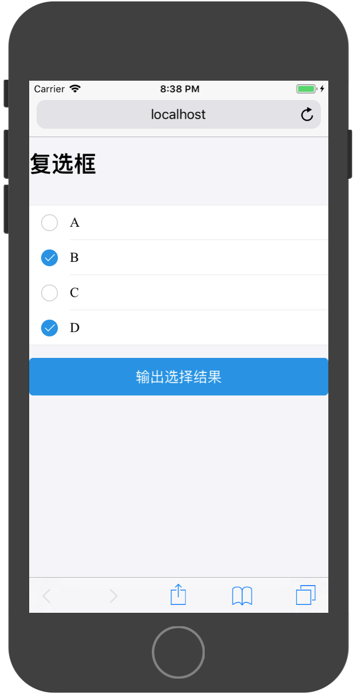
代码实现与单选框类似,但需要注意处理多选的记录情况:
import React, { Component } from 'react';

import { Button,Radio,List,Checkbox} from 'antd-mobile';

const CheckboxItem = Checkbox.CheckboxItem;

//选项数据
const radioDatas = [
  {
    id:0,
    title:'A'
  },
  {
    id:1,
    title:'B'
  },
  {
    id:2,
    title:'C'
  },
  {
    id:3,
    title:'D'
  },
]

export default class App extends Component {

  constructor(props) {
    super(props)

    this.state = {
      checkeds:[]
    }
  }


  render() {

    //通过循环使用单选数据构造RadioItem数组
    const radioItems = [];
    for(let i = 0;i<radioDatas.length;i++){
      const radioData = radioDatas[i];
      const radioItem = (
        <CheckboxItem
          key={radioData.id}
          checked={this.state.checkeds[i]}
          onChange={()=>{
            this.setState((preState)=>{
              const checkeds = preState.checkeds;
              checkeds[i] = !checkeds[i];
              return {
                checkeds
              }
            })
          }}
        >
          {radioData.title}
        </CheckboxItem>
      )
      radioItems.push(radioItem);
    }

    return (
        <div>
          <h1>复选框选框</h1>
          <br/>
          <List>
            {radioItems}
          </List>
          <br/>
          <Button
            type={'primary'}
            onClick={()=>{
              //模拟登陆
              console.log(this.state.checkeds)
            }}
          >输出选择结果</Button>
        </div>
    );
  }
}